
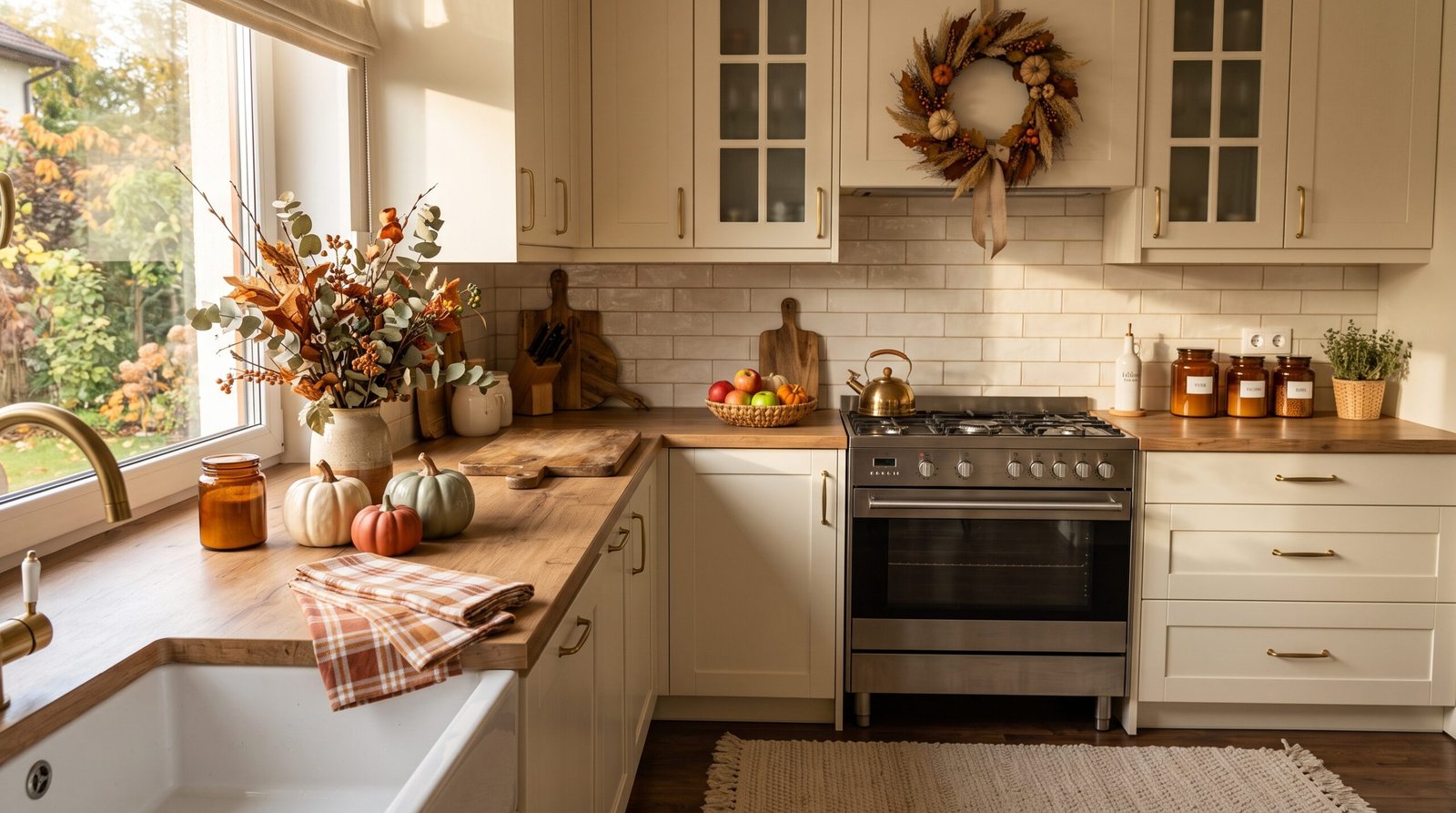
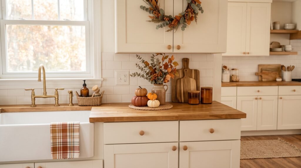
Fall kitchen decor is one of those things that looks effortless on Pinterest but feels completely overwhelming the moment you’re standing in the middle of your own kitchen, wondering where to even start.
And if you’ve never decorated a room intentionally before? That overwhelm doubles fast.
But here’s what nobody tells you: the people whose kitchens look like they belong in a lifestyle magazine didn’t start out knowing what they were doing either. They just learned a few core principles and stopped second-guessing every decision. You can do the same thing. Starting right now.
📋 Table of Contents
- The Biggest Myths About Fall Kitchen Decor (And Why They’re Holding You Back)
- What Fall Kitchen Decor Actually Requires (The Real Facts)
- How to Build Your Fall Kitchen Decor From Scratch (Step by Step)
- Expert Tips That Change How You Think About Fall Kitchen Decor
- Common Mistakes That Ruin Fall Kitchen Decor (Even When Everything Else Is Right)
- What to Do When You’re Stuck (Or When Nothing Looks Right)
The Biggest Myths About Fall Kitchen Decor (And Why They’re Holding You Back)
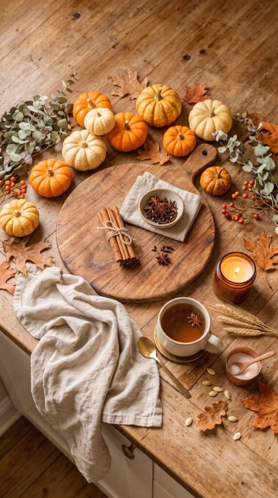
Let’s clear the air before anything else.
Most beginners approach fall kitchen decor with a head full of assumptions that aren’t true. These myths don’t just create confusion — they actively stop people from getting started. And that’s a shame, because fall is genuinely one of the easiest seasons to decorate for.
Myth #1: You need a big budget.
Picture this: someone walks into a home decor store, sees a $45 ceramic pumpkin, and immediately decides seasonal decorating isn’t for them. But the best fall kitchens aren’t built at HomeGoods. They’re built with real gourds from the farmers market, a bundle of cinnamon sticks from the grocery store spice aisle, and a glass jar from the back of a cabinet.
The spending is optional. The intention is not.
Myth #2: Your kitchen has to be a certain style.
This one’s pervasive. A lot of people believe fall kitchen decor only works in farmhouse or cottage aesthetics — shiplap, open shelving, butcher block counters. Not true at all. Fall color palettes (warm terracottas, deep burgundy, burnt orange, natural wood tones) layer onto modern kitchens, minimalist kitchens, even rental kitchens with zero permanent features. The palette does the work.
Myth #3: You need a lot of stuff.
Overcrowding is actually the most common decorating mistake, not underdoing it. Restraint reads as confidence. Three well-chosen items on a counter will always look more intentional than fifteen mismatched ones.
So before you buy a single thing or move a single object, let these myths go. They’re not serving you.
What Fall Kitchen Decor Actually Requires (The Real Facts)
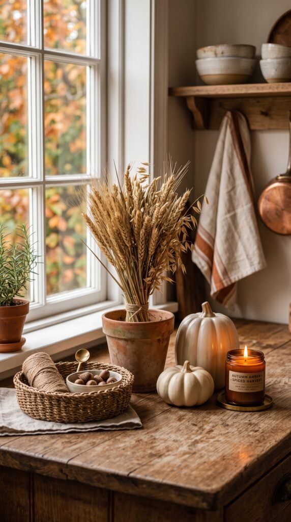
Here’s what actually makes fall kitchen decor work, according to designers who do this professionally.
Fact: It’s about sensory layering, not just visual decoration.
Fall has a texture and smell problem in most kitchens. Visual elements matter, but the kitchens that feel genuinely seasonal engage multiple senses. That means warm-toned lighting (swap a cool-white bulb for a warm 2700K equivalent). It means a candle or simmer pot with cinnamon, clove, or apple. It means textural contrast — something smooth (a ceramic gourd) next to something rough (a natural fiber basket).
According to research on environmental psychology, multisensory environments increase feelings of comfort and belonging — which is exactly the feeling fall decor is chasing.
Fact: Color anchors everything.
You don’t need a design degree to pull a cohesive look together. You just need a three-color rule. Pick one dominant color (let’s say warm cream or natural wood), one accent (deep orange or burgundy), and one neutral connector (black, olive green, or weathered brown). Every element you add should hit at least one of those three colors.
Most beginners skip this step and then wonder why their counter looks “off.” It’s almost always a color issue.
Fact: Proportion and height variation matter more than product selection.
Most people buy items and arrange them at the same height on a flat surface. That’s why it looks flat. Real designers think in terms of levels — something tall (a stem in a vase, a tall candle), something medium (a pumpkin, a small bowl), and something low (scattered acorns, a sprig of eucalyptus lying flat). This applies whether you’re styling a countertop, a windowsill, or a kitchen table centerpiece.
Stop Making These Kitchen Counter Organization Mistakes
Fact: Less effort, placed correctly, beats more effort placed randomly.
A single styled “moment” in your kitchen — one corner of the counter, the space beside the stove, the kitchen table — will read as intentional and polished. Spreading thin decor across every surface just makes the space feel cluttered and random.
Start with one zone. Get it right. Then decide if you want to expand.
How to Build Your Fall Kitchen Decor From Scratch (Step by Step)
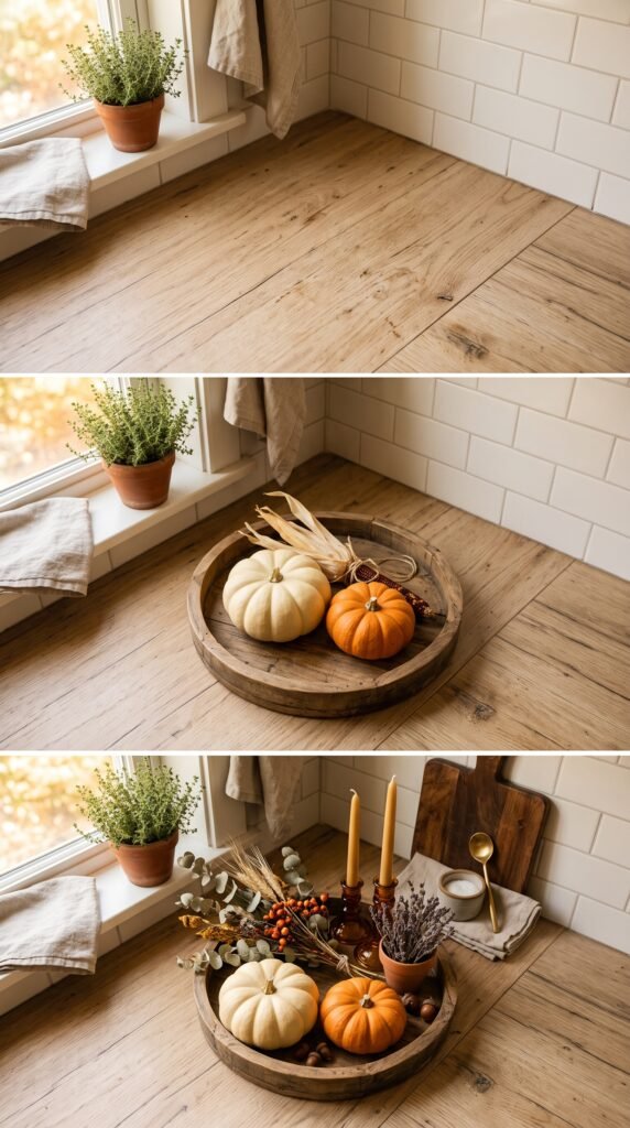
You don’t need a plan. You need a process. Here’s one that works even if you have zero design background.
Step 1: Identify your anchor zone.
Pick one surface. Just one. The kitchen island if you have it, the counter beside the window, the dining table in an adjacent eating area. This is your focus. Everything else in the kitchen gets left alone for now.
Step 2: Clear it completely.
Pull everything off. Give it a quick wipe. Start fresh. This sounds obvious, but most people try to decorate around existing clutter and wonder why the result looks messy.
Step 3: Bring in your base layer.
A wooden tray, a cutting board, or a woven placemat laid flat gives your arrangement a defined boundary. This is the single most underused trick in beginner decorating. A tray creates a “contained” look that reads as intentional even when the items inside it are simple.
Most people skip right to adding the fun stuff. The base layer is what separates the polished look from the “just threw some stuff on the counter” look.
Step 4: Add your three levels.
Remember — tall, medium, low. A candle or small bottle with a dried stem for height. A pumpkin or gourd for mid-level. A few acorns, a cinnamon stick bundle, or a sprig of something textural laid flat at the base.
Step back. Adjust. Don’t rush this.
Step 5: Edit ruthlessly.
Take one thing away. Does it still look complete? It might. Less often looks like more when the remaining pieces are strong. This editing step is what separates “styled” from “decorated.”
Cluttered Kitchen Counter? Here’s How to Fix It for Good
Expert Tips That Change How You Think About Fall Kitchen Decor
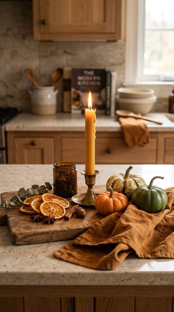
These are the details that separate a kitchen that looks “decorated for fall” from one that feels like fall.
Shop produce aisles, not just decor aisles.
Real pumpkins and gourds from grocery stores or farmers markets are cheaper than ceramic versions, photograph beautifully, and last for weeks. Mini pumpkins in cream, white, and orange mixed together look sophisticated without any effort. A bundle of wheat stalks from a craft store? A dollar. A small jar of whole cloves sitting next to them? Functional AND decorative.
The USDA’s seasonal produce guide confirms fall as peak season for squash, gourds, and ornamental corn — all of which happen to be perfect decor materials.
Use what you already own.
Before spending anything, pull out every wooden, ceramic, or earthy-toned item you already own. Brown pottery. A wooden bowl. A terracotta plant pot. Natural linen napkins. Fall decor doesn’t have a specific product list — it has a color and texture palette. Anything that fits that palette becomes fall decor by placement.
Lighting is a force multiplier.
Here’s the thing: the same arrangement looks amateur under a harsh overhead fluorescent and magazine-ready under warm, dim light. If your kitchen lighting is cold and bright, get a plug-in Edison bulb lamp for the counter, or simply add a battery-operated candle or a real pillar candle nearby. The light transforms the mood without changing a single decor item.
According to lighting researchers at the Lighting Research Center, warm color temperatures (under 3000K) reliably increase perceived comfort and coziness in interior spaces. Worth knowing.
Rotate in November, not December.
Most people leave fall decor up until it starts to feel tired, then scramble for holiday decor. The smarter move is to plan a small transition around early November. Deep burgundy and navy elements bridge fall to winter naturally. A few tweaks to your existing arrangement extends its life without a complete overhaul.
Best Small Kitchen Cabinet Organization Ideas Professional Organizers Swear By
Common Mistakes That Ruin Fall Kitchen Decor (Even When Everything Else Is Right)
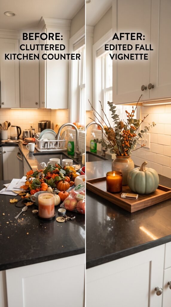
Even people who follow all the right steps sometimes end up with a kitchen that doesn’t feel the way they expected. Here’s why.
Buying only orange.
Orange is autumn’s signature color, but a counter full of orange reads as monotone and flat. It needs contrast. Deep green, matte black, cream, or weathered wood grounds the orange and makes it pop. Without contrast, even the most beautiful individual items compete with each other.
Ignoring the kitchen’s existing colors.
Most people decorate in isolation from their kitchen’s fixed elements (cabinet color, countertop material, backsplash). But those fixed elements are already communicating a palette. If your cabinets are white, cream-and-warm-orange fall decor will look clean and intentional. If your cabinets are dark navy, deep burgundy and gold lean into that naturally. Work with the room, not against it.
Treating it like a display, not a space.
The kitchen is a working room. Fall kitchen decor that blocks the coffee maker, crowds the prep area, or falls over every time someone opens a cabinet drawer isn’t going to stay up long. Decorate for the way you actually use the space, not for how it looks in a photo. Functional and beautiful can coexist — but only if you plan for function first.
Skipping scent entirely.
A kitchen styled for fall but smelling like cleaning products and last night’s dinner isn’t quite there yet. A simmer pot of apple, cinnamon, and cloves takes five minutes and costs almost nothing. A good candle does the same. Scent is the element that makes guests walk in and say “it feels like fall in here” before they even look around.
That’s the goal, right? Not just looking seasonal — actually feeling it.
What to Do When You’re Stuck (Or When Nothing Looks Right)
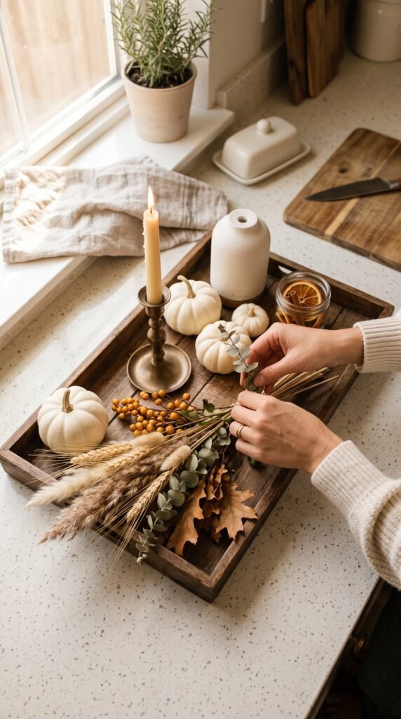
Most people run into this exact problem when they’ve followed all the steps but something still feels off. The arrangement looks fine in theory but flat in practice.
When that happens, try this before assuming you need more stuff.
Change the angle. Move items to the left or right by a few inches. Offset the arrangement instead of centering everything. Centered, symmetrical layouts feel stiff in casual kitchens. An asymmetric arrangement (tall item at one end, medium and low items clustered slightly off-center) almost always reads as more natural and lived-in.
Try removing the item you love most. This sounds harsh. But often the piece you’re most attached to is actually the one that doesn’t fit the palette or proportion of everything else. Set it aside for ten minutes. Look again. If the arrangement improves, that’s your answer.
Take a photo. This is the designer’s oldest trick. Looking at your arrangement through a camera lens (or your phone screen) instantly flattens it to a two-dimensional view, which is how everyone else will see it. Things that looked fine in person suddenly look cluttered or unbalanced in a photo. And things that looked too sparse suddenly look intentional.
According to the American Society of Interior Designers, stepping back and viewing a space through a different frame — literally or figuratively — is one of the most-used tools in professional styling. It’s not a trick. It’s just perspective.
The truth is, fall kitchen decor doesn’t require talent. It requires patience, a willingness to edit, and the understanding that your first attempt is just a starting point. Adjust. Simplify. Trust the process. Your kitchen will get there faster than you think.