
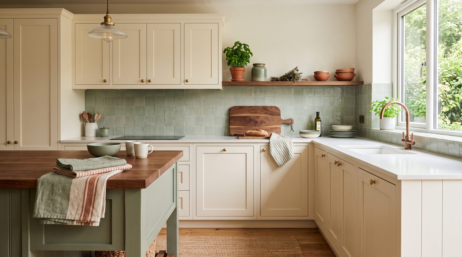
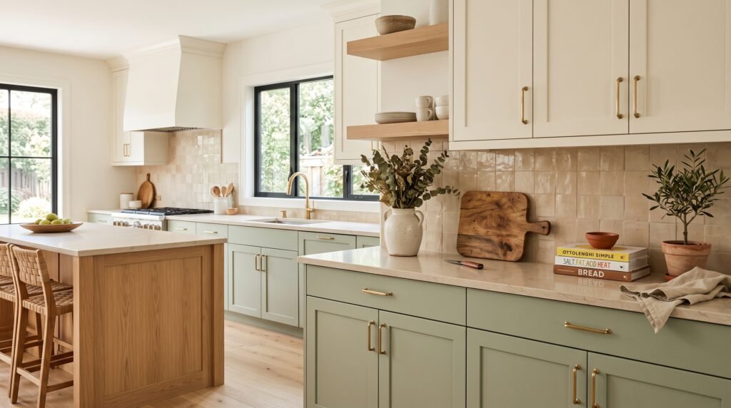
If you’ve ever stared at paint swatches until your eyes crossed, you already know that colorful kitchen ideas sound exciting in theory and completely terrifying in practice. The gap between “I want a bold kitchen” and “I know how to make that happen without it looking like a toddler’s art project” is where most people get stuck. And stay stuck.
This guide closes that gap.
📋 Table of Contents
- Quick Answer: Why Do Colors Clash in Kitchens?
- The Undertone Problem Nobody Talks About
- How the 60-30-10 Rule Saves Colorful Kitchen Ideas
- The Backsplash Trap (And How to Step Around It)
- Color Combinations That Actually Work for Colorful Kitchen Ideas
- Small Kitchens and Colorful Kitchen Ideas: The Rules Change
- FAQ: Colorful Kitchen Ideas, Answered
Quick Answer: Why Do Colors Clash in Kitchens?
Color clashing happens when two or more colors compete for visual dominance without any unifying element to tie them together. It’s not that bold colors are bad. It’s that they need a framework.
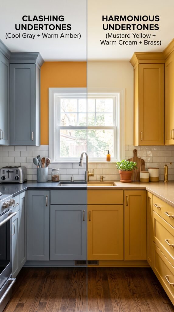
The three most common culprits are undertones that fight each other (a warm beige wall next to a cool gray cabinet), saturation mismatches (pairing a muted sage with a neon yellow), and too many competing focal points pulling the eye in six directions at once.
Fix the framework, and the color problem fixes itself.
The Undertone Problem Nobody Talks About
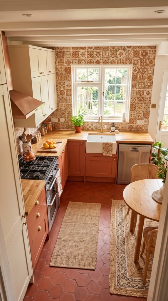
Picture this: you choose a soft white for your walls, a warm oak for your floors, and a greige for the cabinets. On paper, neutral and safe. In real life, the room looks muddy and somehow off, and you can’t figure out why.
Undertones are why.
Every color has a secondary hue hiding inside it. White can lean pink, yellow, blue, or green. Gray can pull purple or green. That “greige” might have a distinctly pink base that fights with the orange warmth in your oak floors.
Before committing to any colorful kitchen ideas that involve multiple finishes, pull every sample into the actual kitchen. Not a showroom. Not a hallway. Your kitchen, in your light, at different times of day. A color that looks cohesive at noon in a south-facing store can turn into a clash disaster by 5pm in your north-facing kitchen.
The fix is simple: pick a dominant undertone and let everything else follow it. If your countertop pulls warm gold, lean into warm hues across the board. Cool gray counters? Pull everything slightly cool. Consistency in undertone is the invisible glue that makes bold colors work.
Farmhouse Kitchen Remodel Ideas for a Warm and Cozy Look
How the 60-30-10 Rule Saves Colorful Kitchen Ideas
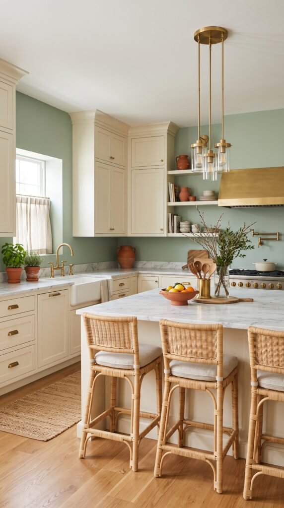
Here’s the thing most decorating advice buries in paragraph nine: colorful doesn’t mean every surface gets a different color. It means intentional distribution.
The 60-30-10 rule gives you a structure that professional designers use constantly. Sixty percent of the space takes your dominant color (usually walls, large cabinet surfaces, or flooring). Thirty percent goes to a secondary color (think island, backsplash, or lower cabinets). Ten percent becomes your accent (hardware, textiles, a small appliance, bar stools).
Most people reverse this by accident. They put the bold color everywhere and wonder why it feels exhausting to stand in their own kitchen.
Take a classic colorful kitchen idea as a working example: deep navy lower cabinets, white upper cabinets and walls, and a warm terracotta accent in the backsplash tile. The navy is the dominant color but it only covers about 30-40% of total visual surface area because the uppers and ceiling are white. The eye gets breathing room. The navy reads dramatic without overwhelming.
That breathing room is doing more work than the navy itself.
7 Must-Have Kitchen Jars That Instantly Make Your Space Look Organized & Aesthetic
The Backsplash Trap (And How to Step Around It)
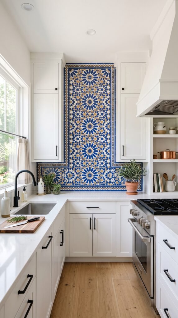
Most people discover colorful kitchen ideas by falling in love with a backsplash tile. Completely understandable. Tile is where the fun lives.
And then they build the rest of the kitchen backward from that tile, wondering why nothing feels right.
Here’s where the trap springs: a patterned or colorful tile already contains multiple colors. If your backsplash has cream, navy, terracotta, and green in it, you don’t need to pick one of those colors for your cabinets AND pull another for your island AND feature a third as your wall color. The tile is already doing all of that work.
The fix? Treat the backsplash as your ten percent or your thirty percent, not the sixty. Pull your dominant cabinet or wall color from one of the neutral or secondary tones already inside the tile. Let the tile be the statement. Let everything else be the setting.
Real designers call this “listening to the tile.” Your backsplash is already telling you what the kitchen wants to be. Most homeowners just aren’t trained to hear it yet.
According to Architectural Digest’s guide to kitchen design, the most successful colorful kitchen renovations treat one element as the clear hero and support it rather than compete with it. That principle applies whether you’re working with a $500 budget or a $50,000 renovation.
Color Combinations That Actually Work for Colorful Kitchen Ideas
Not all pairings are created equal. Some work because of color theory, some because of cultural familiarity, and some just because the proportions are right. Here are the combinations that consistently perform across different kitchen sizes and natural light levels.
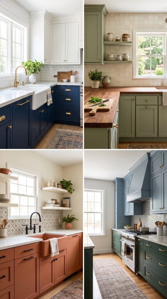
Navy and White with Brass Accents. This one has staying power because navy is dark enough to anchor the room, white provides contrast without competing, and brass adds warmth to prevent the combination from going cold. Works in both traditional and transitional kitchens.
Sage Green with Warm Wood Tones. Sage reads differently depending on light. In a bright kitchen, it goes almost silvery. In a warmer space, it pulls more green. That chameleon quality makes it forgiving. Pair it with natural wood open shelving or a butcher block island top and it reads timeless instead of trendy.
Terracotta and Cream. This combination is making a serious comeback and for good reason. Terracotta is a warm, complex color with red, orange, and brown all living in it at once. That complexity makes it easier to pair than it looks. Cream walls keep it from going heavy. Add black iron hardware and it tips into a warm, earthy look that feels collected rather than decorated.
Two-Tone Cabinetry in Complementary Hues. This is where colorful kitchen ideas get genuinely sophisticated without getting complicated. Upper cabinets in one color, lowers in another. The split naturally uses the 60-30-10 logic because upper cabinets take up less visual space. A dusty blue on top with a deeper forest green below sounds wild and looks incredible.
The Color Association of the United States publishes annual color trend reports that track which hues are entering mainstream interiors. Their research consistently shows that deep, complex colors with gray undertones (what the industry calls “complex colors”) outperform bright, saturated primaries in residential interiors over time because they age better with changing accessories.
Small Kitchens and Colorful Kitchen Ideas: The Rules Change
Small kitchens make people nervous about color. The instinct is to go white, go light, go safe.
That instinct is half right.
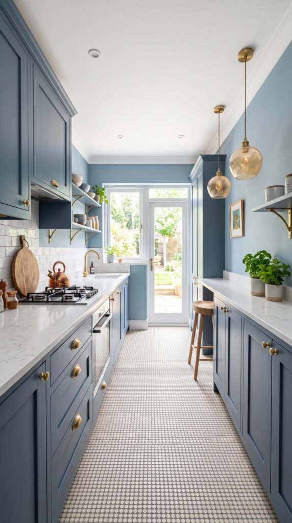
Light colors do expand perceived space, but a small kitchen can absolutely carry color if it’s used with discipline. The key difference: in a small kitchen, contrast is your enemy. High contrast between wall color and cabinet color makes a small space feel choppy and smaller. Lower contrast, meaning both the walls and cabinets sit in a similar tonal range, keeps the eye moving rather than stopping at every boundary.
Think of it as tonal color. A kitchen with pale blue walls, slightly deeper blue-green cabinetry, and a soft white ceiling reads colorful but cohesive. The eye doesn’t stop at the wall-cabinet junction. It travels. The room breathes.
According to Better Homes & Gardens’ small kitchen guide, using a single hue in varied shades throughout a small kitchen creates the illusion of a larger, more intentional space while still giving you the personality that all-white kitchens lack.
Where you can introduce contrast in a small colorful kitchen: bring it in vertically. A colored ceiling in a small kitchen adds drama without cutting the room horizontally. A painted ceiling in a deep hue with lighter walls draws the eye up, which reads as height.
Transform Your Kitchen Corner in 1 Hour – Easy Kitchen Decor Ideas
FAQ: Colorful Kitchen Ideas, Answered
Q: Will bold kitchen colors hurt resale value?
Not the way most people think. Research from Zillow’s paint color analysis found that specific colors in specific rooms can actually boost buyer interest and sale price, depending on execution. A sloppy paint job in neutral beige hurts resale more than a well-executed navy kitchen. Buyers respond to spaces that feel considered.
Q: How do I know if my kitchen gets warm or cool light?
Check at three times: morning, midday, and late afternoon. If your kitchen faces east, morning light is warm and golden but afternoon light goes cold and flat. South-facing kitchens get consistent, bright, warm light all day. North-facing kitchens get cool, diffused light that makes some colors look gray or washed out. This matters because a warm color in a south-facing kitchen looks saturated and rich. That same color in a north-facing kitchen might look muddy.
Q: Can I use multiple bold colors without it looking chaotic?
Yes, but you need a unifying element. That’s usually one of three things: a consistent metal finish across all hardware, a grout or trim color that appears in every color zone, or a dominant neutral that all the bold colors connect back to. Without that unifying thread, multiple bold colors read as chaos no matter how individually beautiful each one is.
Q: What’s the easiest first step for someone afraid to commit?
Paint the island. The island is a single surface, isolated enough that it reads almost like furniture. If you hate the color, repainting one surface is far less painful than repainting an entire kitchen. But most people who paint their island don’t hate it. They love it so much they go back for the lower cabinets within six months.
Q: Are peel-and-stick backsplash tiles a good way to test colorful kitchen ideas?
For color-testing purposes, yes. For long-term use, it depends on quality. Premium peel-and-stick options have improved significantly, and in a rental or a room where you’re genuinely unsure about a color direction, using temporary tile to test the visual impact of a color before committing to real tile is smart. Pull the sample up after two to four weeks and see if you still love it. If you do, that’s your answer.
Q: My kitchen has brown cabinets already. How do I add color without replacing them?
Paint them. And if that feels like too much, start with the backsplash and hardware. Swapping out brass hardware for matte black changes the whole undertone of brown cabinets. Adding a colorful backsplash that plays up the warm undertones in the wood grain gives the kitchen personality without touching the cabinets at all. Sometimes the brown isn’t the problem. It’s everything around the brown that needs attention.
Q: How many colors is too many?
A useful rule: if you can list every color in your kitchen and get past five distinct hues, you probably have one too many. That includes the floor. Most well-designed colorful kitchens operate on three to four true colors, with variations in tone or finish adding visual richness within that palette rather than expanding the palette itself.